The desktop site is here!
This was the original form of my blog when I first ported it from Blogger to GitHub Pages in 2018. However, the history goes back further than that. Originally, this was the interface created for the computer science club site at my university. We were building something much more ambitious than just a desktop in a browser back then, we were building a whole blog platform complete with a CMS and everything. We were not that far away from finishing it by the time we stopped.
Having already built sites like this before, I had insisted that we separate out some of the components into their own repositories at one point, and the result was windowTools and widgetTools. Together, these provide a JavaScript interface to program a desktop and widgets like you would on a native development kit like GTK+ or Tk. This meant that these components were free for use elsewhere. Just like I figured, they ported fairly smoothly into my Pelican theme, and now will get updates just like the rest of the blog.
If you're interested in my porting process, here's how I went about it, with screenshots!
First Steps
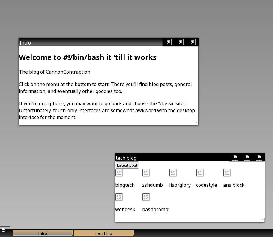
First step was to copy/paste the old desktop site to the new site. In the process, I inlined my old "blog.js" script into the body of the page.

It does work, in spite of the total lack of every image used in the page:
Adding Content from Pelican
so, I moved on to add categories. This was straightforward. I had mentioned that I had already used Pelican at Kitsune Security, so I was already used to how it does loops over content. I did end up referencing the categories page to make this work, but I ended up with this:
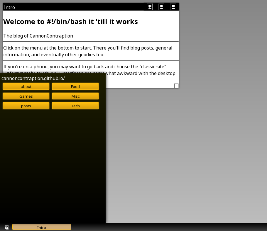
You'll see a category here called "posts". I thought this was some feature of Pelican to make a section for all posts, but in fact I had mislabeled one of my posts at that time, so Pelican had filled in the default category, "posts" instead of "misc" like that one should have been.
The next step was to iterate over all of the posts to make their icons. Again, there are no resources here. I figured out how to use the Jinja2 truncate() routine to get the titles to fit. I eventually discarded this, since WidgetTools does that on its own.
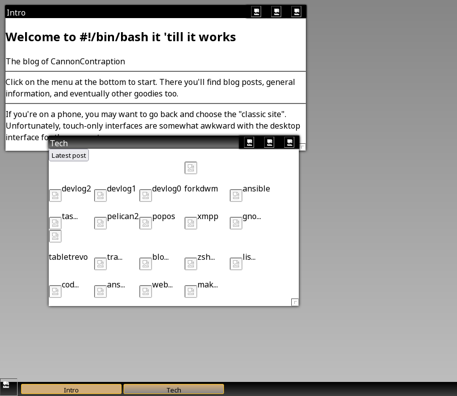
The way the old desktop site worked was by loading iframes that contained the pages in the "classic" site. See the full story or my other posts about blogging for more on that. However, this made it really easy to just link the existing iframe code into Pelican and get it to display a post. Maybe at some point I'll make this a little smarter, so you can't launch the desktop from within a desktop window (which works fine right now, by the way) but this is the solution I stuck with. Links still work in the page, which is a huge advantage.
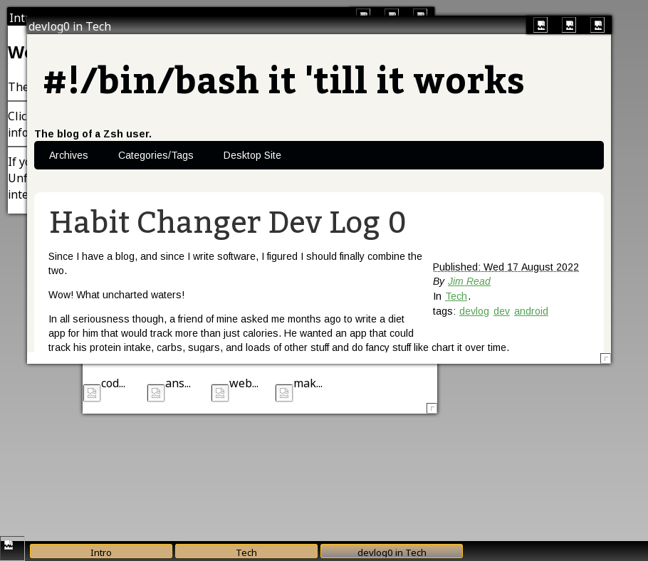
Theme and Visual Style
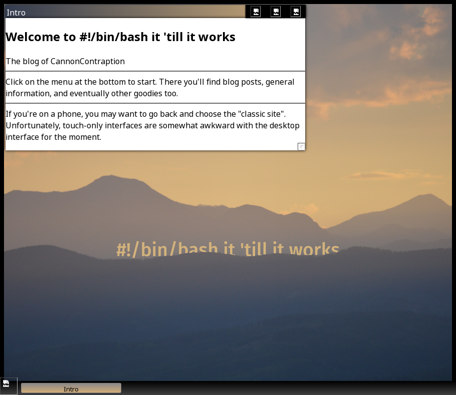
I then ported the theme CSS and pointed the background image at the correct resource in Pelican's theme structure. The way this is handled is layered. This means that if you just clone windowTools, you'll get the default look and feel. It's kind of orangey and gross looking, but it's functional. Then, instead of modifying windowTools, the approach I use (and encourage) is to define another stylesheet after the fact with all of the customizations you want to make the desktop your own. In my case, this is the gradiated Win2K-style titlebars, the background image and black fallback color, and a custom set of taskbar button colors. I may have customized other things, but I still like the theme so I just copied it from the old desktop site pretty much unchanged.
windowTools and widgetTools Changes
The next part was to modify windowTools and widgetTools. They both kind of expect that they're always going to be in the site root, or at the very least in the same directory as the base page. Of course, Pelican sorts things rather differently, so I had to change them so that they add a relative path variable to find their image resources. For windowTools, I made that a JavaScript variable wtoolspath, and for widgetTools wtoolsrpath. In the case of the desktop site, I set these like so:
wtoolspath="/theme/scripts/"
wtoolsrpath="/theme/"
since windowTools and widgetTools are submodules checked out in my blog source in themes/bashworks/static/scripts/, meaning Pelican puts them in theme/scripts in the generated result, and the 'resources' folder for the icon theme in widgetTools is in theme/resources, but widgetTools already looks for resources/ so all I need is the path to the theme directory added on the front. My hope is that this approach won't mess up any existing installations. Maybe I'll roll back a copy of my site to the old version and see if it still works when I git pull these changes.
This made the maximize, minimize, close, and menu buttons show up. However, I missed one and the grab handle for resizing windows still isn't there. I won't bother pointing out when I add it, since it's the same change. You'll be able to see it anyhow.
![]()
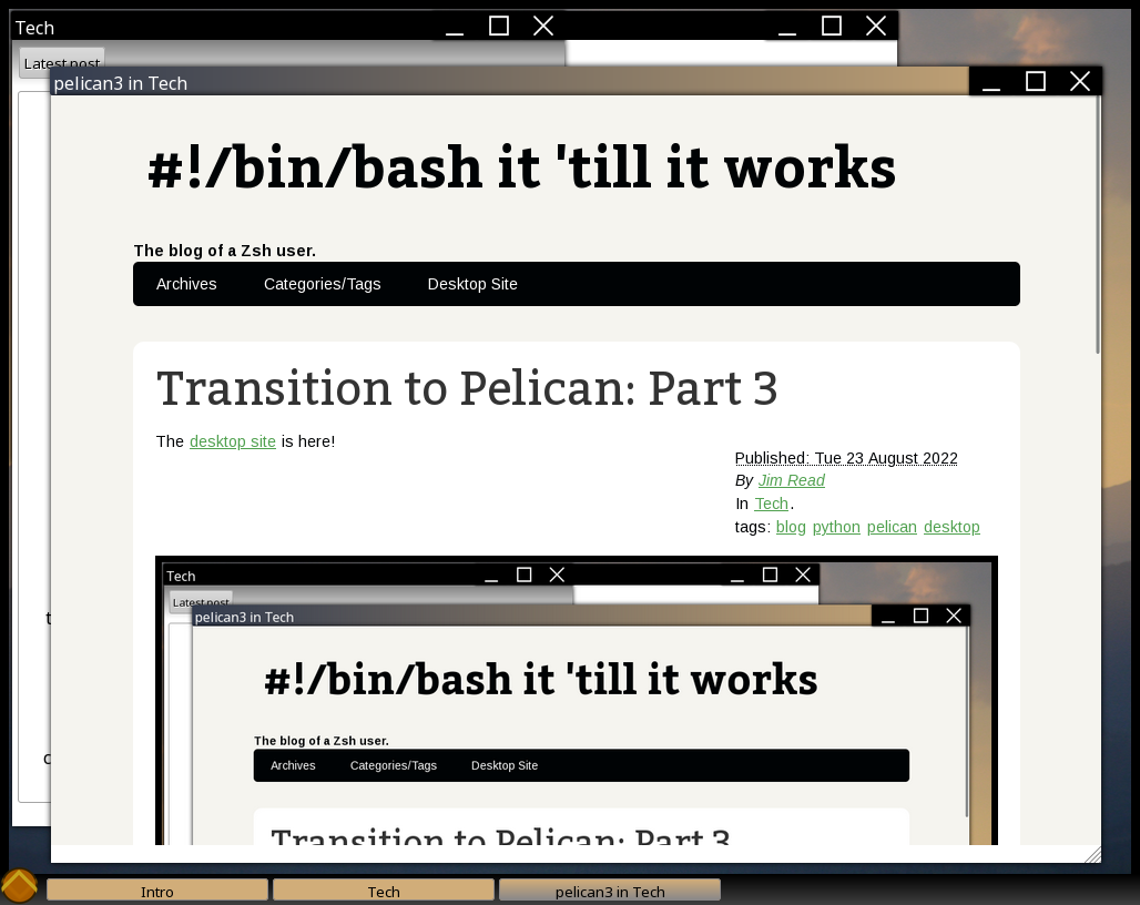
This is when I realized that fact about loading the desktop within a desktop within a browser within a desktop. You can stack this as many times as your screen and RAM will fit, by the way. I find this hilarious:
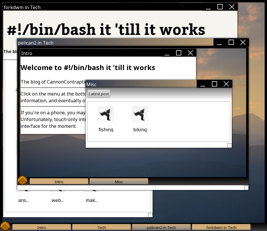
Final Polish, Backend Fixes
This is when I started putting some polish under the hood. I started playing with the number of characters that would fit in an icon (only to find they get trimmed anyhow based on width), hooked up the "latest post" button so that it updates when I post something new, and rewrote the intro screen. Originally, the intro screen was a set of individual "label" div elements with separators programmed in via widgetTools. This is pretty inefficient, so I ripped that out. I then told Pelican to grab the content of the desktop.md file containing the metadata that points to the desktop site in the theme and use that for the intro instead. This meant that the desktop specific intro screen pulled content out of the otherwise unused content section for the desktop. Personally, I like it when things work out like that.
I Have Now Transitioned to Pelican
That's it! The desktop is ported! If you're on a phone right now, I wouldn't recommend trying the desktop site. Open your laptop for this one if you're interested. It doesn't work at all on touchscreens (last time I tried) and isn't designed for phones anyhow. You aren't missing any content on the main site, it's just a normal website rather than a desktop.
So, I suppose that's it now. My whole site is managed by Pelican. My goal with the last change to the split site I was using was to lower the amount of work required to post something new. I had hoped that this would encourage me to write more and turn the blog into the exercise in writing that I had hoped it would be from the start. While it did encourage me to branch out and I ended up writing about a lot more than just tech shortly after, the post about the porting process was the last tech post that I made until I started this transition to Pelican.
Pelican, on the other hand, has made it simple and quick enough to post new things that I do it regularly now. I don't think I could come up with a better endorsement for the software than that. As the cherry on top, my desktop in a browser ported smoothly, so there's basically no drawback and the final product is just as complete as the old version (but much better looking, I can't stress that enough).
I'm Also Not Done
If you've ever used Pelican, the theme I use is probably pretty familiar. It's still the basic 'notmyidea' theme, just modified to include the desktop site, responsive web design, and some colors that I like better. It's still (at its core) the default theme. If the site doesn't look that familiar, I've either finished making my own theme from scratch (or modifying this one beyond recognition) or Pelican has a different default now.
The desktop site also wasn't really optimized for a lot of posts. This means that if you open it on a smaller screen then open the "tech" category, you'll only be able to open the most recent posts. The older ones clip off the bottom of the screen. I think at one point I had a scrollbar in there, but I haven't put it back yet. It's a simple change though, so it'll probably get fixed quickly.
I'm probably also never going to be done tweaking the blog. Like I hinted at in my first post in this series, I enjoy messing with this stuff. Blogging is a lot of fun, and the supporting tech is similarly cool, making things like a really, really fast user experience that doesn't degrade with JavaScript turned off, or a very fast desktop in a browser written in plain JavaScript, no frameworks.
If this is your thing, feel free to subscribe via Atom or RSS, links below. I don't have a comments section here right now, but you can always send me an email if you want to suggest something, or just say hi!